

|
|
| T-shirt | ||||||
 |
||||||
| Previous Image | Next Image | ||||||
|
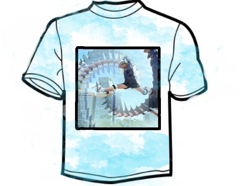
Description: www.pro-jump.com on the back Might be copyright problems with that picture but I could chage that Picture Stats: Views: 684 Filesize: 56.45kB Height: 600 Width: 800 Posted by: Dusty12 at September 27, 2007, 05:31:58 PM Image Linking Codes
|
||||||
| 0 Members and 1 Guest are viewing this picture. |
| lara Posts:21 | September 27, 2007, 06:00:27 PM try reducing the saturation of the background, also try a nice gausina blur, or radial blur would look good, and increase sharpness of person, more on bocks and slightly increase the saturation, might look quite good. Nuff critisim from me, looks great as it is, just advice. PS. I phail at spelling, I know. |
| Bbmthbloke Posts:2363 | September 27, 2007, 05:36:05 PM 'where did you get that hat, where did you get that hat'  |
| steve76 Posts:146 | September 27, 2007, 05:33:52 PM id do it in a way that makes the springs more noticable.. as they are the thing we are promoting  |
Powered by: SMF Gallery